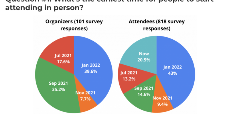
Learn what 900 attendees and organizers said. Are you struggling to organize and create great experiences for virtual and hybrid events? A recent survey collected from over 900 event organizers and attendees… More »
2021 Digital Trends Report: Increase in Social Media Spending, Social Research and Boomers on Social Platforms
Did you know that the average person spends about 7 hours per day on the internet? That is a 9% increase from 2020’s average, meaning we almost spend as much time online as we… More »

The Digital Trends Shaping Marketing Strategies in 2021
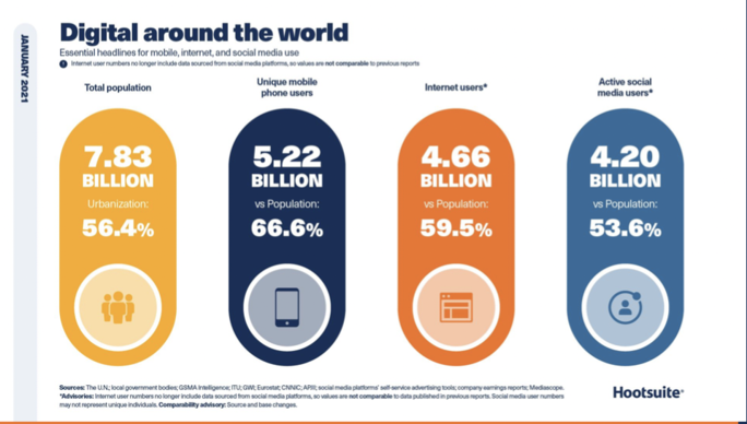
In a comprehensive LinkedIn SlideShare, Hootsuite and We Are Social teamed up to summarize the digital trends of 2020. From internet use to social media reach, this summary of trends… More »

Google AdWords Industry Benchmarks for 2020
Wordstream, an official Google Premier Partner, compiled their PPC statistics as they do each year in their Google AdWords Industry Benchmarks for 2020. In addition, this year they also released… More »

Naming Your Baby; Choosing The Best Possible Name For Your Company or Product
So, you’ve decided to have a … company. One of the first (of many) decisions is what to name it, right? This is an important, and often emotional, decision that… More »

Persona Profiles: Defining Your Target Audience Is Your First Step
In response to the ever-increasing pressure to deliver ROI immediately, marketers (and founders) often skip over the important strategic step of defining their target customer. There just doesn’t seem to… More »

Ready to Launch? Four Simple Questions to Ask Before Launching Your Product
Before you jump off the deep end and launch your new product, let’s check in on a few simple questions you can ask to make sure the product is indeed… More »
Announcing Launching for Revenue: How to Launch Your Product, Service or Company for Maximum Growth
I am excited to announce the publication of my latest book, Launching for Revenue: How to Launch Your Product, Service or Company for Maximum Growth, due in March 2018. If you… More »
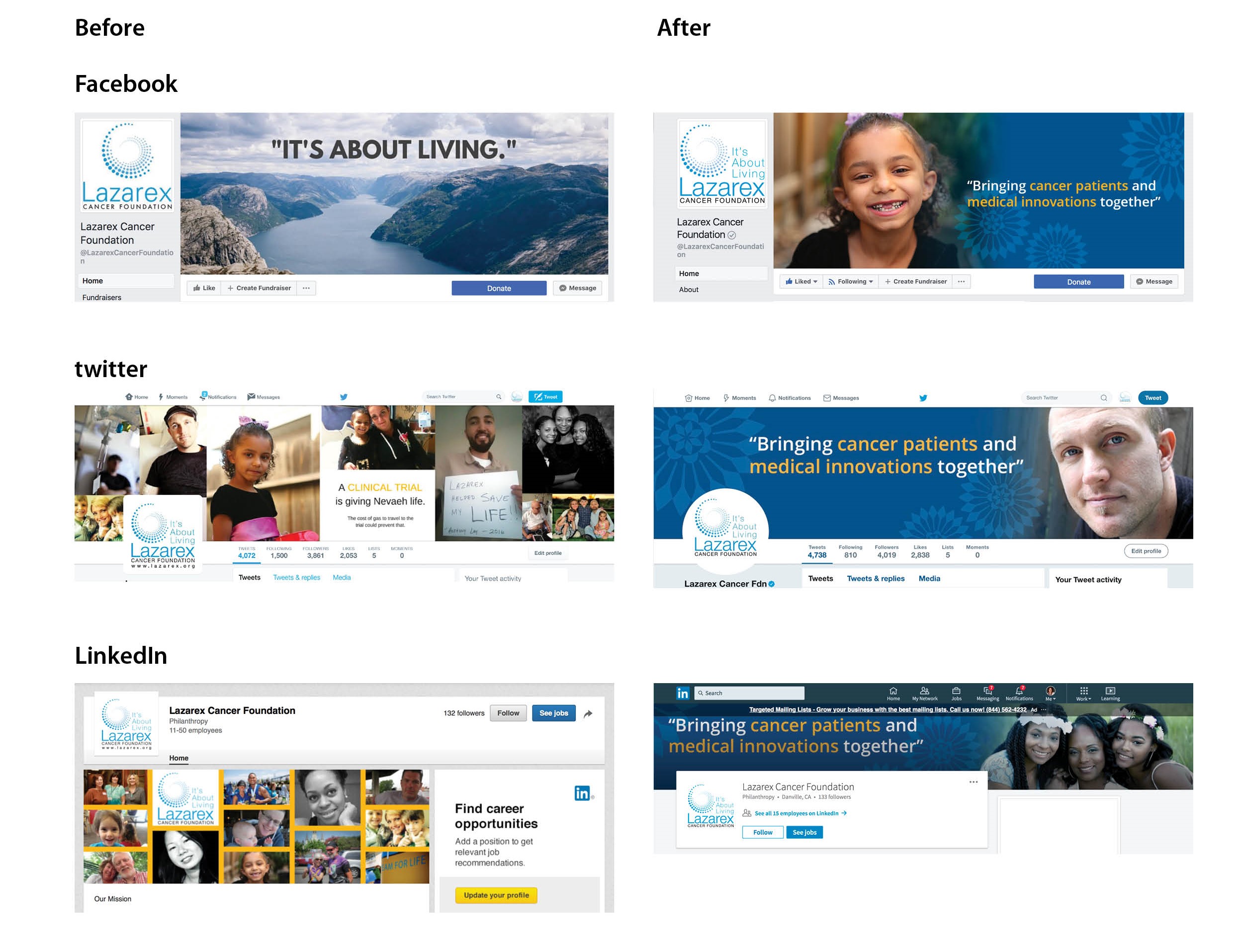
Case Study: How to Drive Triple-Digit Increases in Social Media Reach and Engagement
One of our clients, Lazarex Cancer Foundation, a nonprofit that improves patient access to cancer clinical trials, was having some success with their social media but wanted it to be… More »
ThinkResults Marketing Named One of the Top Agencies in Silicon Valley
The results are in — we are honored to announce that we have been listed as a top marketing agency in Silicon Valley for the fourth year in a row by the Silicon… More »
ThinkResults Ranks as the 10th Fastest Growing Private Company in Silicon Valley
We at ThinkResults Marketing are incredibly honored and excited by our latest award as the 10th fastest growing private company in the Silicon Valley area! Each year the Silicon Valley… More »
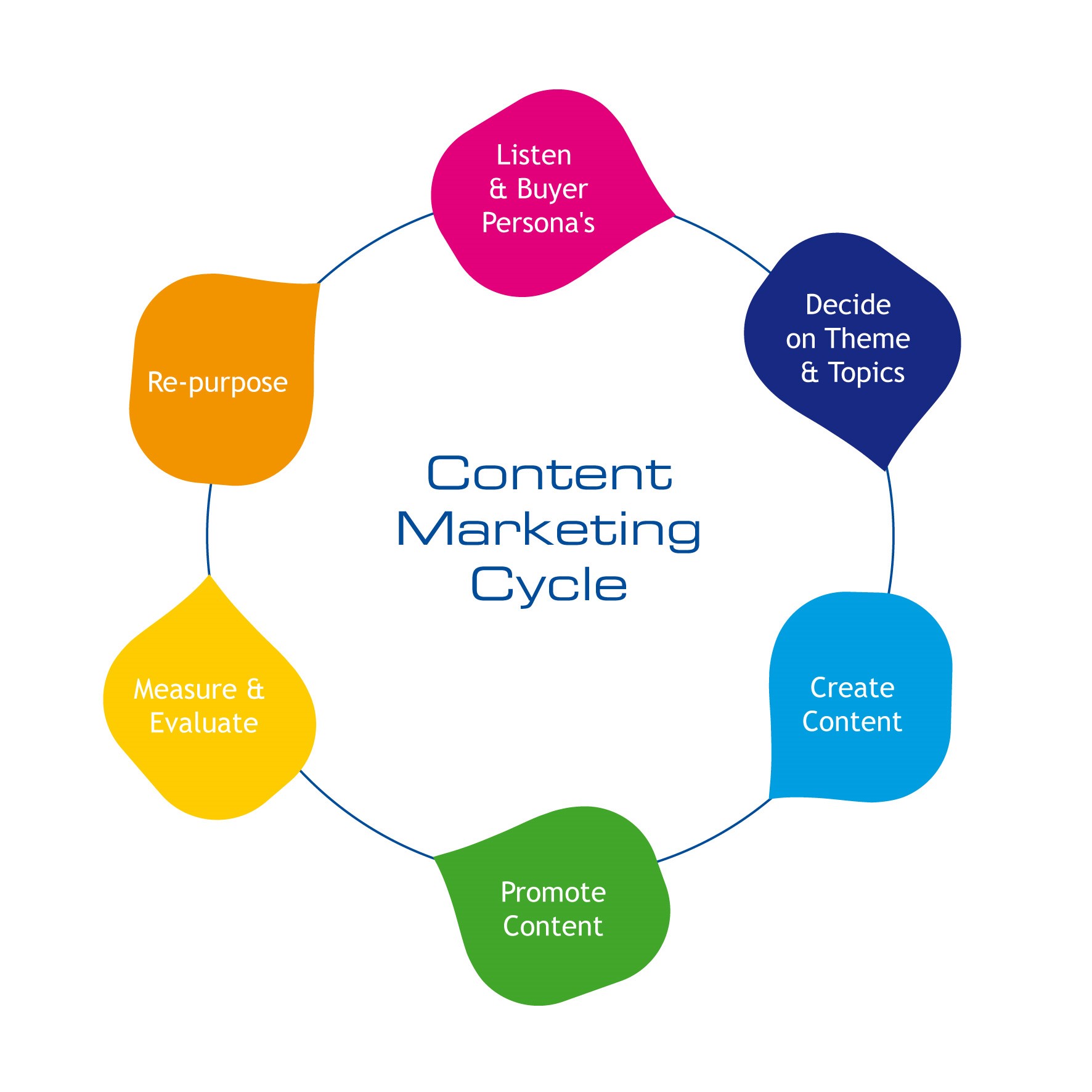
Content Marketing Made Easy: How to Create 50+ Quality Pieces of Content in a Snap
Content marketing can be hard work. Especially long-form content creation such as whitepapers, podium presentations, keynotes and books. Here are our tips on how to create quality pieces of content in a snap!

Leaders Network Retreat Provides Insights and Connections to Fuel Business Growth
“In order to understand the world, one has to turn away from it on occasion.” – Albert Camus Turning away from the day-to-day busy-ness of running your business is critical… More »

Take the Leap – Insights from the Watermark Innovation Conference
The Watermark Innovation Conference is an annual event that examines why innovation is so imperative to the success of companies across all disciplines. Each year industry leaders share cutting edge… More »

Writing Effective Emails – Make Sure You’re Getting Heard
Email has been around for well over a decade and is a valuable tool that most of us use daily. Because so much of our business communications are done via… More »

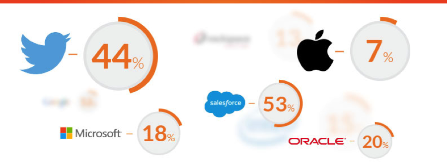
Marketo Benchmarks: How Does Your Marketing Strategy Compare?
Over 1300 marketers from businesses of all sizes were surveyed for the 2017 Marketo North America Marketing Benchmark Report which looks at technology, multi-channel strategy, lifecycle marketing and metrics reporting. I’ve pulled out… More »

Defensive Domain Strategy: Don’t Be Like Donald
An oft-overlooked piece of developing your online presence is your domain strategy – and your defensive domain strategy. Just ask Donald Trump. Although the Trump Organization apparently owns 3,643 domain… More »
How to get up to 111% growth rates? Check your marketing budget.
“How much should I be spending on marketing?” That is a very important and common question we hear at ThinkResults. Traditional guidelines indicated that about 10% of revenue should be… More »