Just had my virgin Virgin America experience and it was awesome. I am a new convert. They take air travel to a very civilised 😉 plane. Not only do they understand their travelers and what they want — flexible, personal food and drink delivery, personalized viewing options, great music, power at every seat (the only way I could have written this blog on the plane home from a Big Data conference given my dying laptop battery) — they also pay very close attention to detail.
And design junkies like me sit up and take notice.
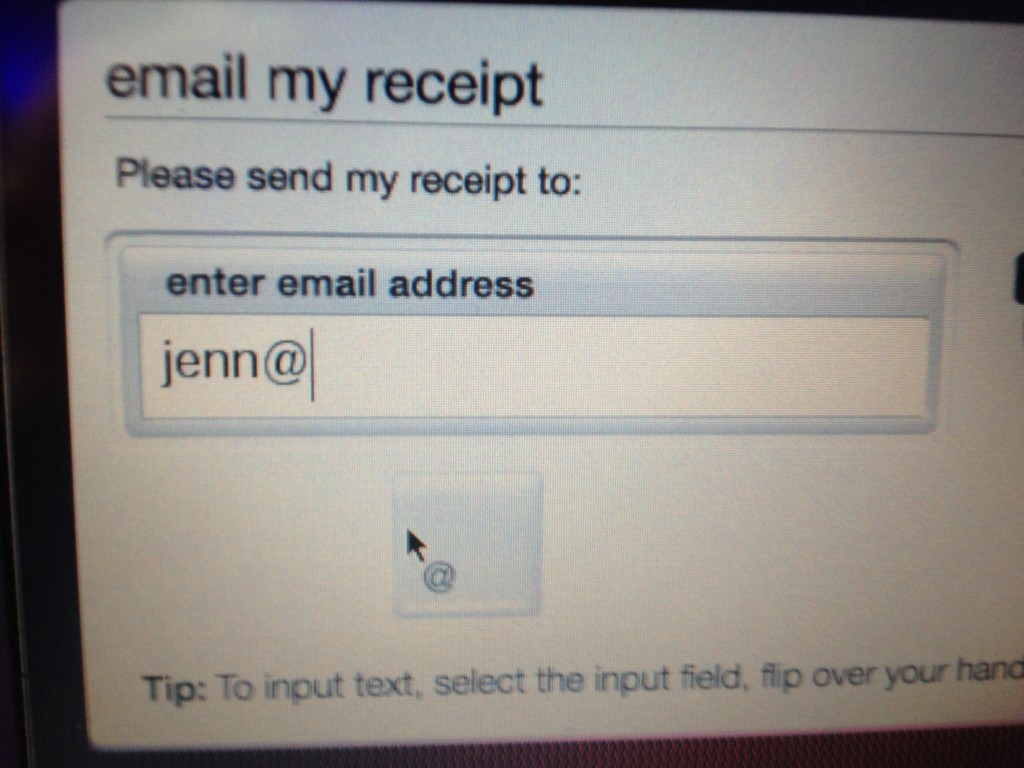
After I ordered my meal and well-earned and civilized G&T through an online shopping interface, I swiped my card to pay and the system offered to send me a receipt via email. So I grab the little handset that allows me to type in my address. As I’m struggling to find the “@” symbol on the little handset (ah, the joys of being over 35!), I realize that on the touch screen they have conveniently placed a large “@” button:

because of course, every user will need this symbol to complete this field. It’s a small design detail but indicative to me of the attention to small details in all aspects of the Virgin experience. To me, this is what separates a brand leader from a commodity. In every way, including all non-human interactions, the environment is designed to cater to me. I feel like Virgin cares about me, which is not my experience on other airlines.
Nicely done, Virgin. I’ll be getting more experienced with you.