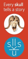
 Getting stuck in San Francisco traffic means I get to look around at what’s happening in the city. I always enjoy the colorful pole flag banners lining the streets around the city advertising various cultural exhibits. Last week when I was on my way to Sausalito for a meeting, I spied the California Academy of Sciences banners and the logo design for their new Skulls exhibit.
The logo for the Skulls exhibit is positively brilliant. At first, I couldn’t quite figure it out, but it was certainly drawing me in as I tried. Then I realized the logo design was the letters of the word “skulls” used to make a skull. Clever. Clean. Elegant. And the font choice (something my tech clients often blow off as irrelevant) is what really makes this logo work so well. It’s clean, modern and thin like a line, making it the perfect tool for this execution:
 This is in contrast to the KwikShop logo I see every Saturday when I train my Golden Retriever at Operation Freedom Paws in Gilroy. Every time I see this logo, I cringe. I often imagine the conversations in the conference room where someone approved this monstrosity ….
 While I was working with my puppy this past weekend, I spent a lot of time thinking about this logo, trying to figure out what the white thing in the middle was. Is it a flag in the wind? Is it supposed to be some abstract version of a map of the U.S.? It is such an odd shape. I’m really unclear as to what this logo is trying to communicate. Perhaps that there are many colors of product wrapping inside our store? Or maybe outside the store as trash, because I certainly see a lot of that around their store? (I digress into sarcasm now …. Here’s a pic of my puppy to perk us all up now.)
There are so many things wrong with this KwikShop logo. It has too many elements for starters (6 colors in the image alone and 7 elements … ugh). Then that grey border bounding it all in is necessary to contain its exuberance but what was really needed was more restraint to begin with! I’m all for abstract logo design. I just want it to be clean, simple and truly abstract. I’m not sure what the concept was intended to represent or what their objectives were with this logo design but this just a weird execution.
What are some of your favorite or weirdest logo designs? Would love to see your examples!
Complimentary Consultation
Jenn LeBlanc, CEO & Founder of ThinkResults Marketing, works with tech CEOs and CMOs to drive results. Whether it is a 350% increase in web traffic, a 1400% increase in online leads, or a 400% increase in conversion rates, Jenn delivers results.
Contact Jenn for a free 30-minute consultation about your marketing project. Start driving your results today.