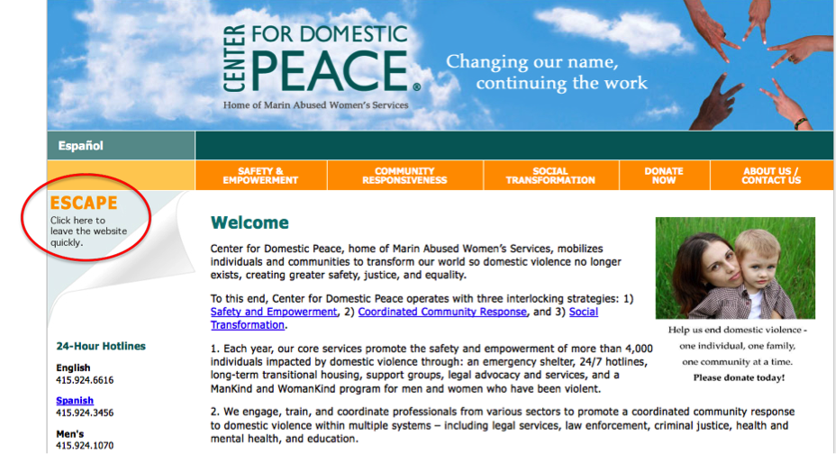
In web design, as in life, sometimes the smallest gesture can make the biggest impact.
I was recently asked by a Board member of the nonprofit, Center for Domestic Peace to help them with their brand strategy. So first thing I did was look up their website (like 90% of people).
What struck me the most was the “Escape” on the upper left column of every page.
This is clearly an organization that knows its audience. They are very aware that a domestic abuse victim researching the site might need to get off the page very quickly should her attacker enter the room. And they made that very easy and safe for use. Nicely done!
What simple features could you add in your next redesign to make life easier for your users?
