It’s that time of year. Prediction articles abound. Saw one set of web design predictions recently that I really liked because I’ve been thinking a lot recently about how web design is changing. Again.
Here are my top five predictions for what I think are the most important web design trends, and how I see them changing the web experience (and some wishes for what I hope won’t happen … a girl can always hope).
1. Visual content frameworks
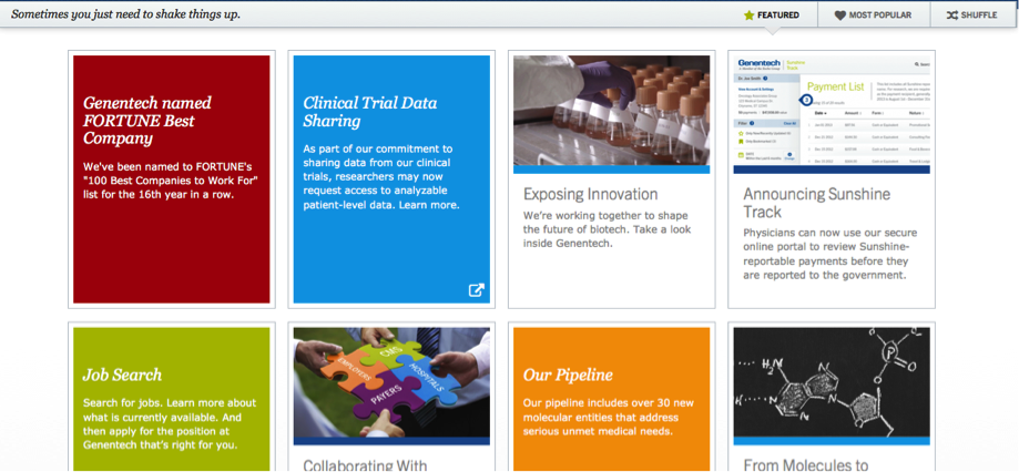
User experiences like Windows 8 and Pinterest have changed the way we look at content. I see a growing trend of using cards or tiles to showcase content. This can be especially great for portfolio sites. But it can work for any content really. Genentech has recently changed their design to incorporate tiles effectively:

This trend can also been seen in the large imagery I’m seeing in more and more sites these days. A card or tile layout isn’t necessary to make this work. A large central image works just as effectively. This is an example of a site we designed using this technique:

2. Greater simplicity
I see websites going back to being more stripped down, with more content on blogs and social media, versus residing on their main site.
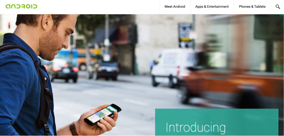
Simpler navigation, back to basics. Android is a good example of this:

3. Fewer words, more visuals
This trend flows out of #1 and #2 and I think this is an important trend. Let’s face it, no one reads anyway and they never did. ;( So the more we can streamline the words and use visuals to tell our story, the more likely it is that someone will get it.
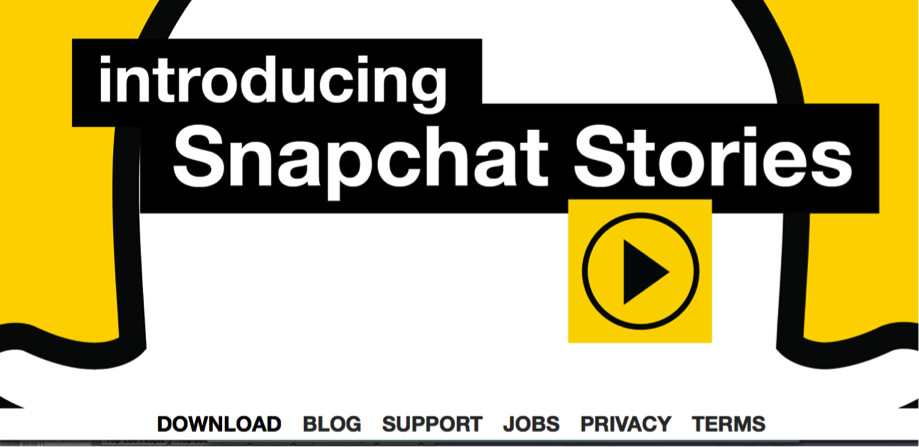
This trend, however, could go too far. I particularly dislike sites that ONLY have a video to tell their story. Business people are not always in a position to watch a video. Give the user options. Always. This is one trend I’m hoping doesn’t go to the extreme like Snapchat did.

4. More HTML5 and other “coolness” factors
I love a shiny object as much as the next tech girl, especially in the web design world. I used to design websites back when those shiny moving balls would spin – it was so cool! I’ve seen a lot of trends come and go. HTML5 enables a high level of cool into site designs, enabling video and audio more easily.
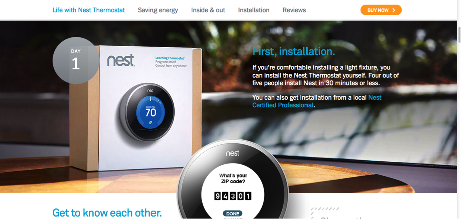
I love the nest site for so many reasons. It incorporates many of the trends I think we’ll see more of in the next couple of years. One of my favorite elements is the little “Day 1” element that moves with you with through the page as you scroll (the flat image does NOT do it justice – check out the real thing online to see the interactivity).

5. Mobile design “first”
Once something clients thought of as an afterthought, we are seeing more and more requests to incorporate responsive design into the project from the get go. Fortunately, we’ve been advocating and doing mobile responsive sites for years. Although I agree with this post stating that it is still a “mobile second” world, I LOVED these metrics on increased conversions from implementing a mobile strategy.
I personally am SO annoyed when I cannot complete a transaction or find info I want online when I am on my phone, and I know it causes lost income, so I was thrilled to find solid evidence of this effect. Mobile devices and screens of all sizes will become more and more the norm. Check your own Google stats to see how your users have changed over the last year or two. Get ahead of this trend and give your users the experience they want.
So what do you think we’ll see in the years ahead? Leave your predictions in the comments below.
Complimentary Consultation
ThinkResults Marketing is a full-service marketing agency specializing in launch and repositioning projects. We have helped dozens of Silicon Valley and global clients raise millions of dollars in additional revenue and funding.
Call for a free 30-minute consultation about your marketing project with Jenn. Email us to set up your complimentary consultation and start driving your results today.