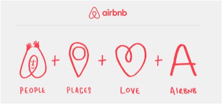
While there has been a ton of controversy about the new Airbnb logo design (it’s too sexual, it looks too much like another logo launched at nearly the same time), dubbed Bélo, I want to speak out in its defense, and in defense of their overall launch strategy.
On the day of the launch of the logo (and in fact, the complete rebrand), I received an email from Airbnb (we recently used Airbnb on a trip to Chicago and were delighted by the experience) explaining the thinking behind the new brand. I was blown away by the thoughtfulness behind it.
The idea behind the new brand was to develop a simple symbol that anyone could create (in fact, they encourage users to “create their own Bélo”). The most interesting positioning of it for me was that it is based on the most fundamental human need, belonging. The images on the site showed people arriving and integrating into their new surroundings easily, the dream of every traveler. The symbol is a combination of a People, Places, Love:
Unlike another highly regarded hospitality rebrand that also launched this summer and shall go unnamed, Airbnb thought about every element of the brand and how it would impact users, touching on a very fundamental need and building everything about the rebrand around that. And then communicated this clearly at every touchpoint.
I’m not surprised it’s controversial. They took a strong stand, executed it well, and are now standing firm. Bravo, Bélo and Airbnb!
By the way, Airbnb is worth approximately $10M, more than all but three of America’s largest hotel chains ….
Complimentary Consultation
Jenn LeBlanc, CEO & Founder of ThinkResults Marketing, works with tech CEOs and CMOs to drive results. Whether it is a 350% increase in web traffic, a 1400% increase in online leads, or a 400% increase in conversion rates, Jenn delivers results.
Call for a free 30-minute consultation about your marketing project with Jenn. Email us to set up your complimentary consultation and start driving your results today.
