These six basic but oh-so-often violated simple rules should guide the design for any website. Despite the simplicity of these, we’ve seen every single one of these rules being broken over the years — from different sets of navigation on each page of a website to a home page containing a book’s worth of content. Both designers and clients need to understand that the print world and online world are vastly different environments with vastly different expectations, and these rules can help easily guide your next website redesign.
1. Digestible Content
The short attention span of Internet consumers demands instant gratification from websites. The average user spends 10-20 seconds on a webpage. You gotta’ make your point quickly in this environment.
This demand may stem from the fact that consumers can be connected anywhere and anytime. Mobile devices combined with 3G, hotspots, and free Wi-Fi gives consumers access to information 24/7.
This demand may also come from societal changes in which people have become less patient and search for quick fixes. Whatever the reason, a website should be designed with this in mind.
First of all, content should be as concise as possible. With shorter attention spans, people don’t want to do a lot of reading. Large blocks of text are likely to scare off site visitors.
Secondly, content should be broken up into “digestible” bits. People don’t read web pages like they read a book; instead, they quickly scan it. Chunking content into smaller digestible bits makes the website friendly to scanning. Content can be made more digestible by breaking it up with:
- headings
- subheadings
- bolding, italics
- bulleted lists
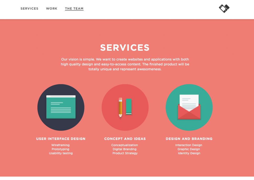
Example of digestible content: Applove
Applove’s website uses 3 columns, icons, and lists to make their services content digestible.
2. Guiding the Eye
People need to be led through the information on a webpage. To guide the eye, the important pieces should be given more weight in the design. A website design should also take advantage of how people typically read and engage with a screen. The first place people look in a browser is the top left corner, which is why this area is the most popular spot for logos. After this, the design needs to lead visitors through the website.
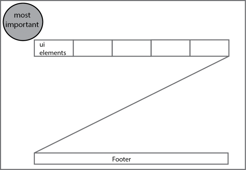
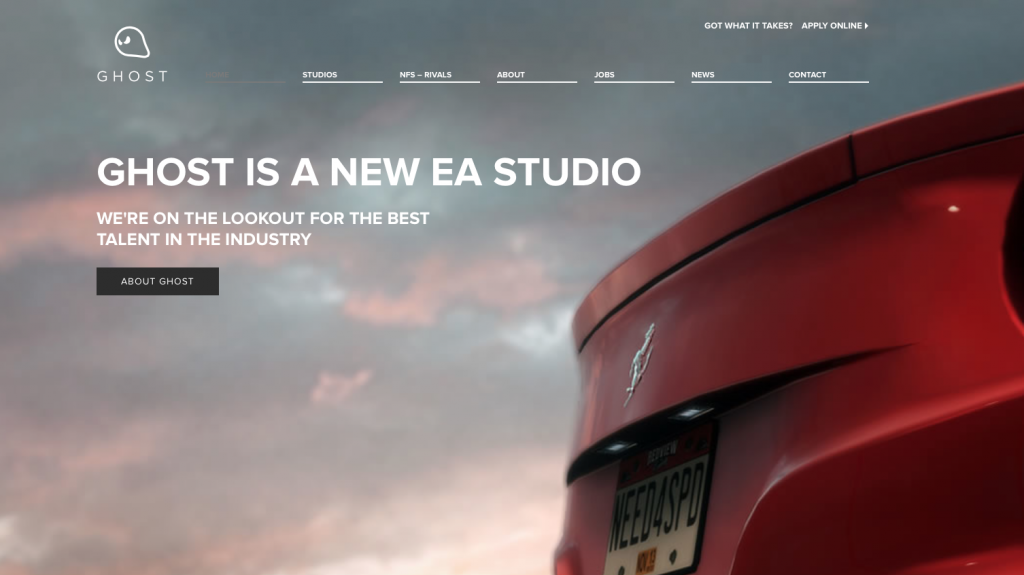
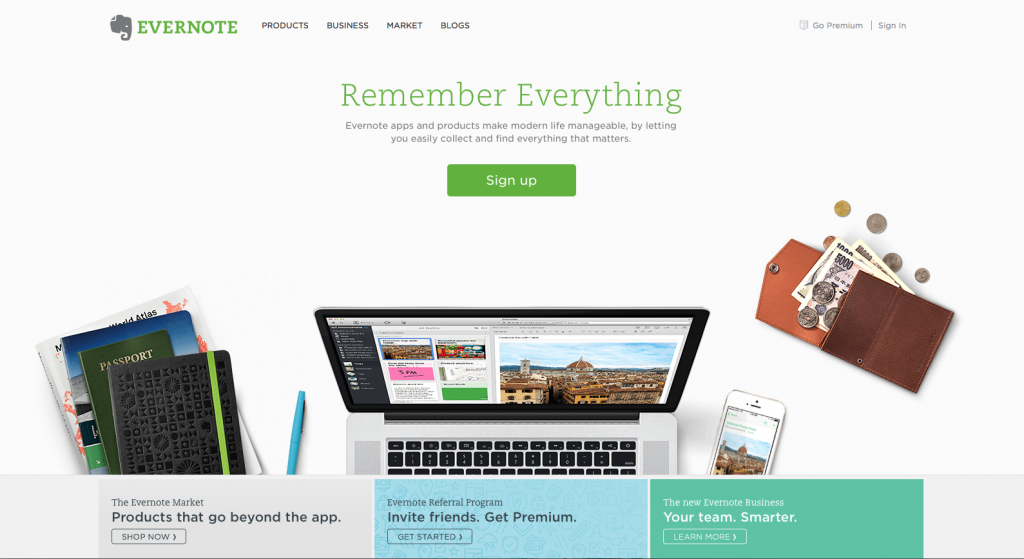
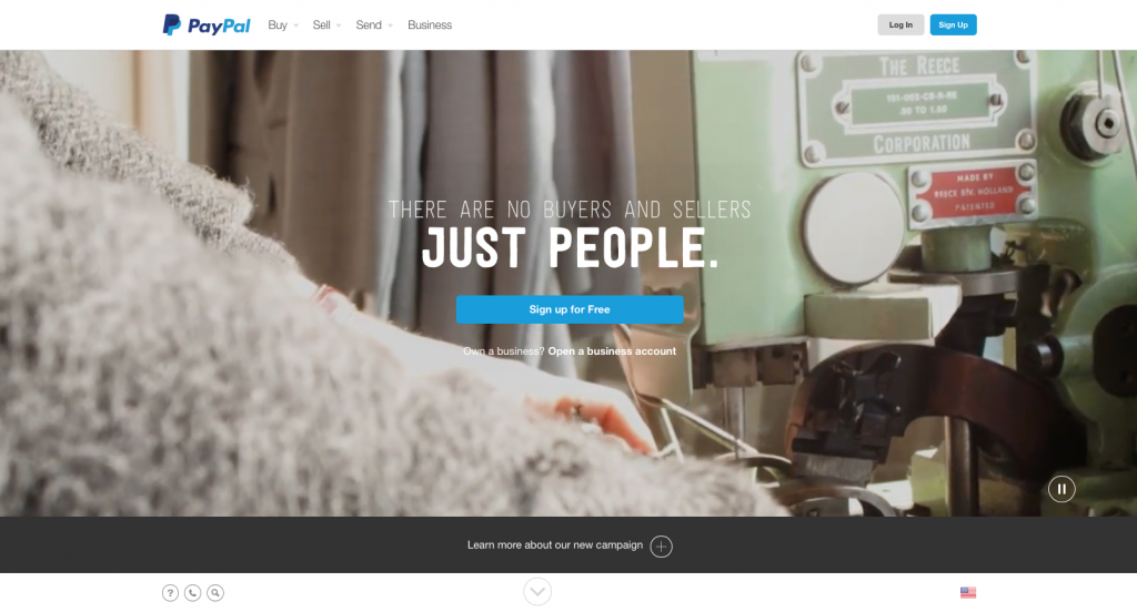
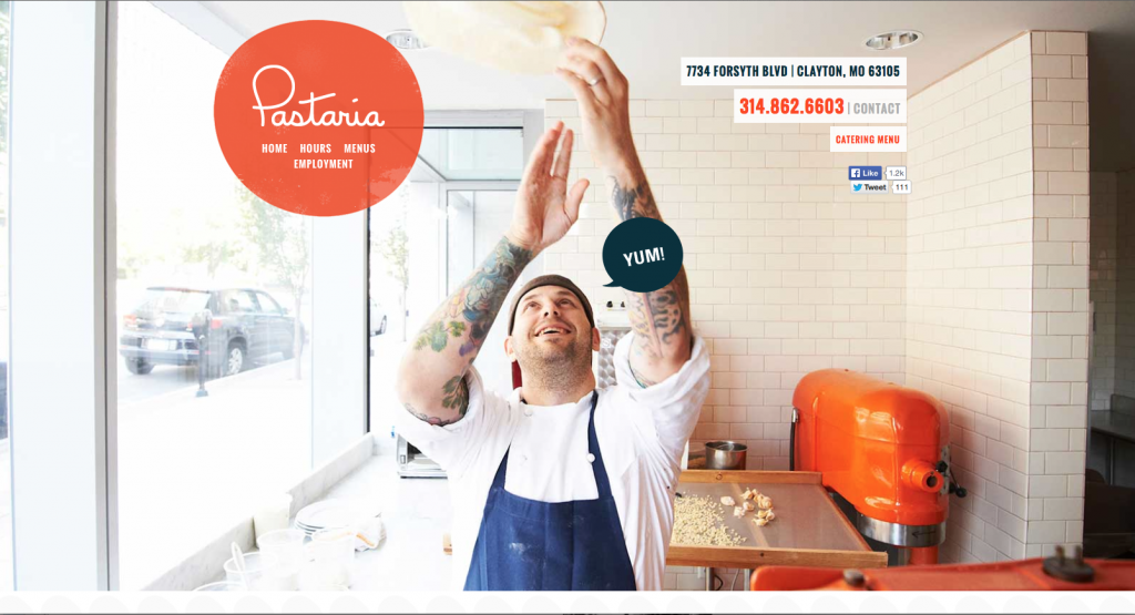
The layout of a website is the first decision on how to guide the eye. Two of the most popular layouts are the F composition and Z composition. Both compositions designate the top left corner for the most important element. As the names suggest, the F composition guides the eye along the path of the letter F and the Z composition guides the eye along the path of the letter Z. Above the fold and Canvas (see examples below) are two other layouts that have recently become more popular, but F and Z are still the most common.
Other important design choices that influence how people perceive importance and help to guide the eye include position, color, contrast, and size.
F Composition: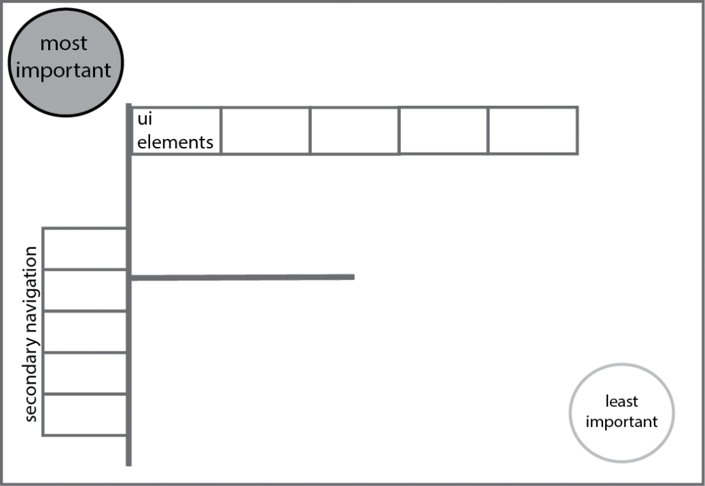
Z Composition:
F Composition example: Ghost Games
Z Composition example: Evernote
Canvas Composition example: PayPal
Above the Fold Composition example: Pastaria
3. Straightforward Navigation
The main navigation should be easy to find and use, which is why on most sites it is placed close to the top of the page. The hierarchy of pages in a website needs to be logical and clear so that site visitors can easily use the navigation. This seems like common sense, but it is very important (and too often ignored in the design process).
There should be a clear indication of where you are on a site. Usually this is done by changing the state of the button associated with the page you are on. For larger websites, there may need to be a trail (breadcrumbs) for the visitors to clearly understand where they are in the site.
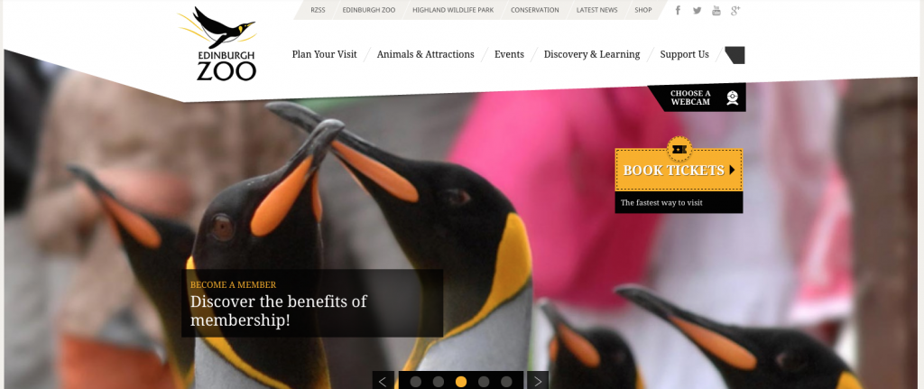
Example of straightforward navigation: The Edinburgh Zoo’s website
The Edinburgh Zoo’s website has a very clear navigation. The navigation bar is placed near the top and to the right of the logo. It is located in a quiet space so the text is easy to read. Each button in the navigation has a drop down menu with more options that populates when the user hovers over the button. Once the button is selected it changes color to indicate which the page the user is on. There is also a breadcrumb trail to make sure the user knows exactly where they are.
4. Appropriate Spacing
There are three key areas of spacing:
- line spacing
- padding
- white space
Line spacing is the space between the lines of text. When the space is small the lines of text start to crash into each other, which makes the content very hard to read. When the space is large the lines of text appear to be unrelated to each other.
Padding is the space around objects. The general rule is that text should never touch other objects. Padding around text makes it easier for people to read.
White space refers to empty space in a website’s design. There needs to be plenty of empty space to balance all the text, images, and graphics on a website.
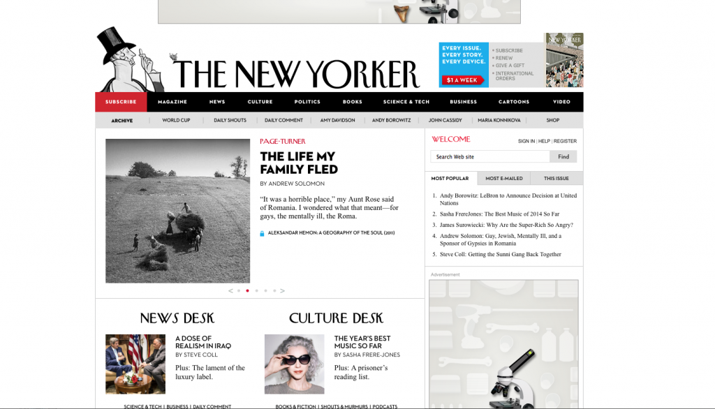
Example of appropriate spacing: The New Yorker
The New Yorker’s website has plenty of white space, appropriate line spacing, and suitable padding around images and text blocks.
5. Readable Typography
There are several considerations with the typography on a website design.
The font choices are a significant decision in designing a website. In general, there should be no more than three fonts. Usually there is a font for the headings and a font for the body copy. The third font could be in the logo, navigation, or subheadings. The font for the body copy needs to be the most readable. Simple san serif fonts like Helvetica, Arial, and Verdana work well for the body copy. The titles and headings can use a font that is more decorative because they will be in a larger font size.
The line length of the text is an important choice in formatting. There are many different character and word limitations floating around as rules, but in fact there is no hard rule. In general, long line lengths are hard to read so smaller line lengths work best.
The color of the text has a large impact on readability. The text color needs to highly contrast the background to make it easy for people to read.
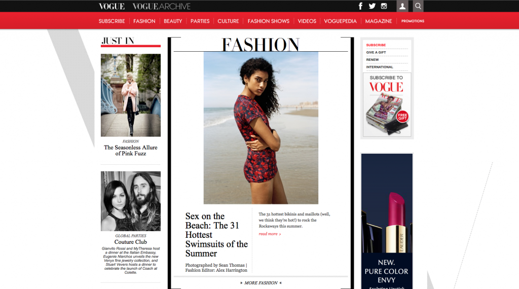
Example of readable typography: Vogue
Vogue’s website uses 3 different fonts. The first font used is the logo font, which is also for the titles on the page. The second font is a sans serif font used in the navigation bar. The third font is a serif font used for the subheadings and body copy. The sizes are appropriate for readability and the line lengths are short.
6. Mobile Friendly
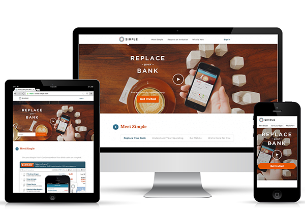
People are accessing web content from their phones, tablets, laptops, and desktops. Mobile now accounts for 25% of all web usage. This means that a website needs to be designed to fit a large variety of screen sizes. There are two ways to approach this: a responsive layout or a separate mobile site. Designing a website with a responsive layout means that the website will automatically adjust itself to fit different screens. The second approach is building a separate mobile site that is optimized for mobile users.
Example of responsive layout:
Source: Synecoretech
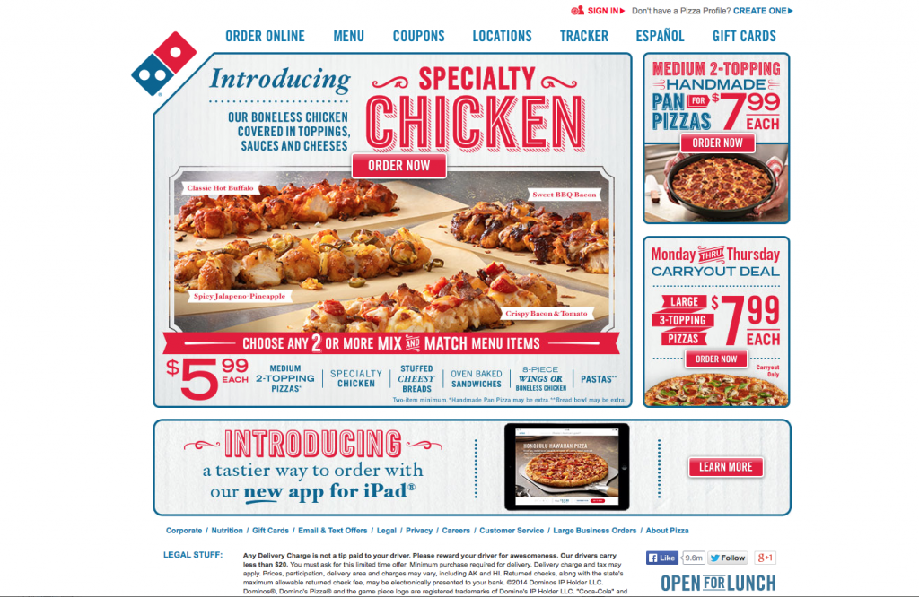
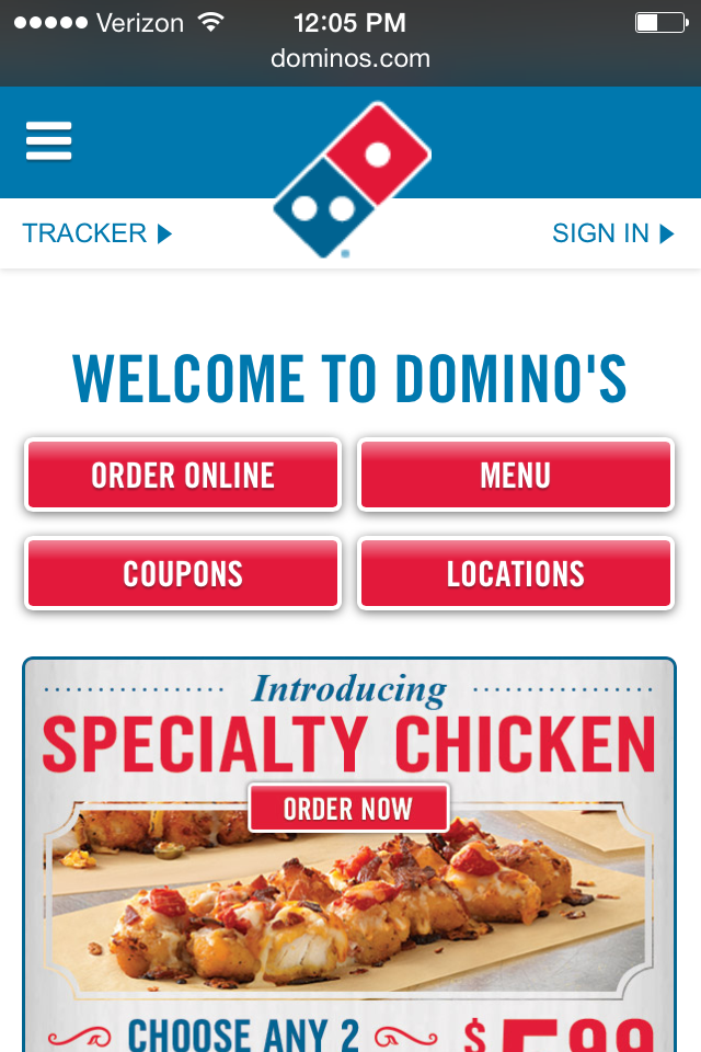
Example of a separate mobile site: Domino’s desktop and mobile websites
Websites have to be carefully designed because with just one click visitors can leave the site. Following these six rules may seem simple, but they are very important to a website design’s success. Website designs need to be centered on the visitors’ experience. Each rule shapes an aspect of a website that if done incorrectly will drive visitors away.
Did we miss any important rules? Let us know!
Complimentary Consultation
Jenn LeBlanc, CEO & Founder of ThinkResults Marketing, works with tech CEOs and CMOs to drive results. Whether it is a 350% increase in web traffic, a 1400% increase in online leads, or a 400% increase in conversion rates, Jenn delivers results.
Contact Jenn for a free 30-minute consultation about your marketing project. Start driving your results today.
